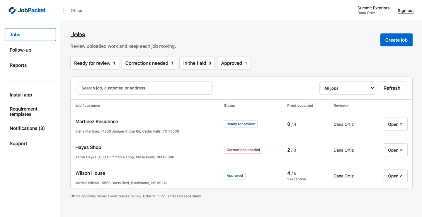
JobPacket
Website, dashboard & mobile app
 Design Peach
Klassen Window & Door Co. / Website, ads & print design
A website, campaign graphics and print materials that feel like the same company. For Klassen Window & Door Co., the design carries from the screen to the brochure, postcard and front door.
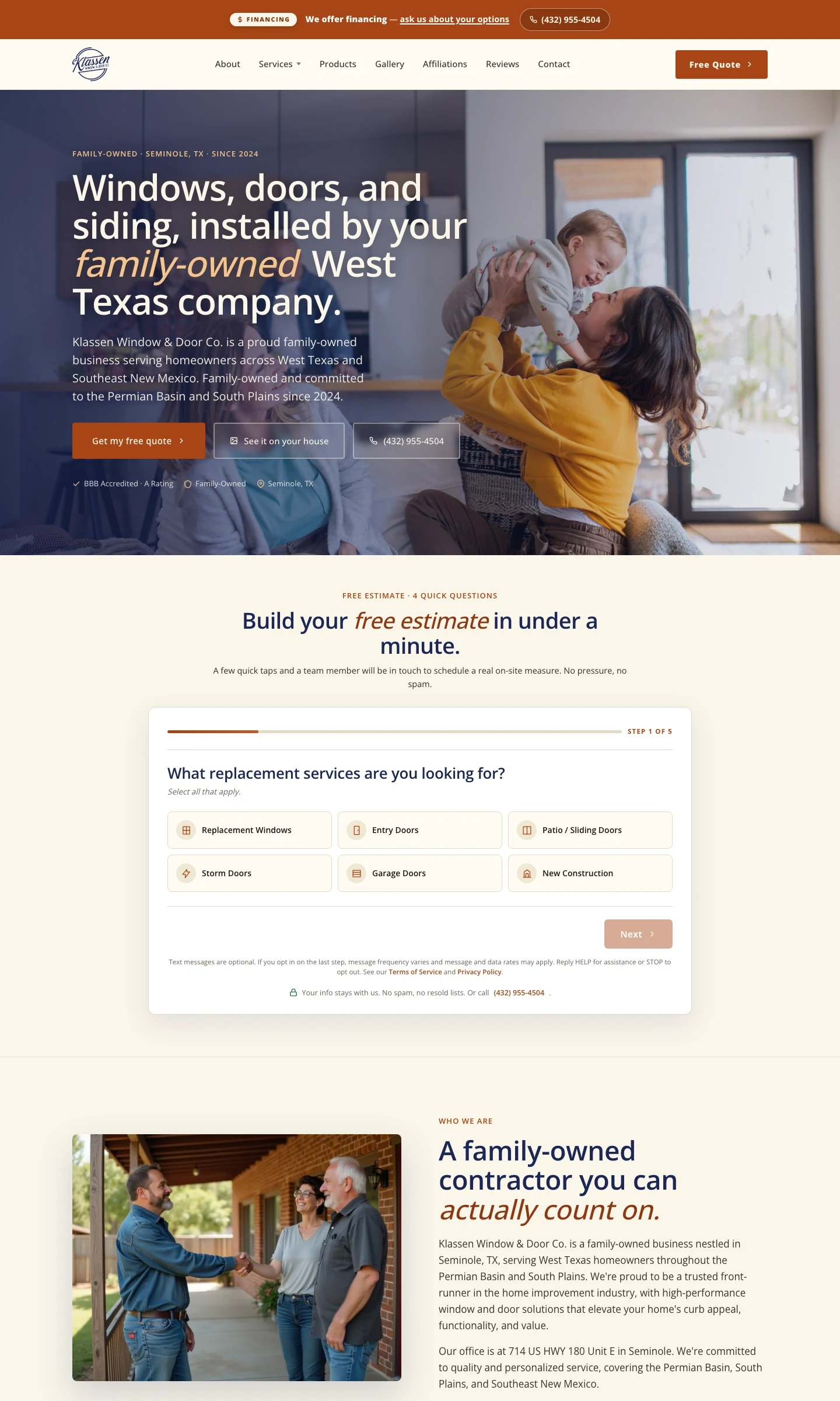
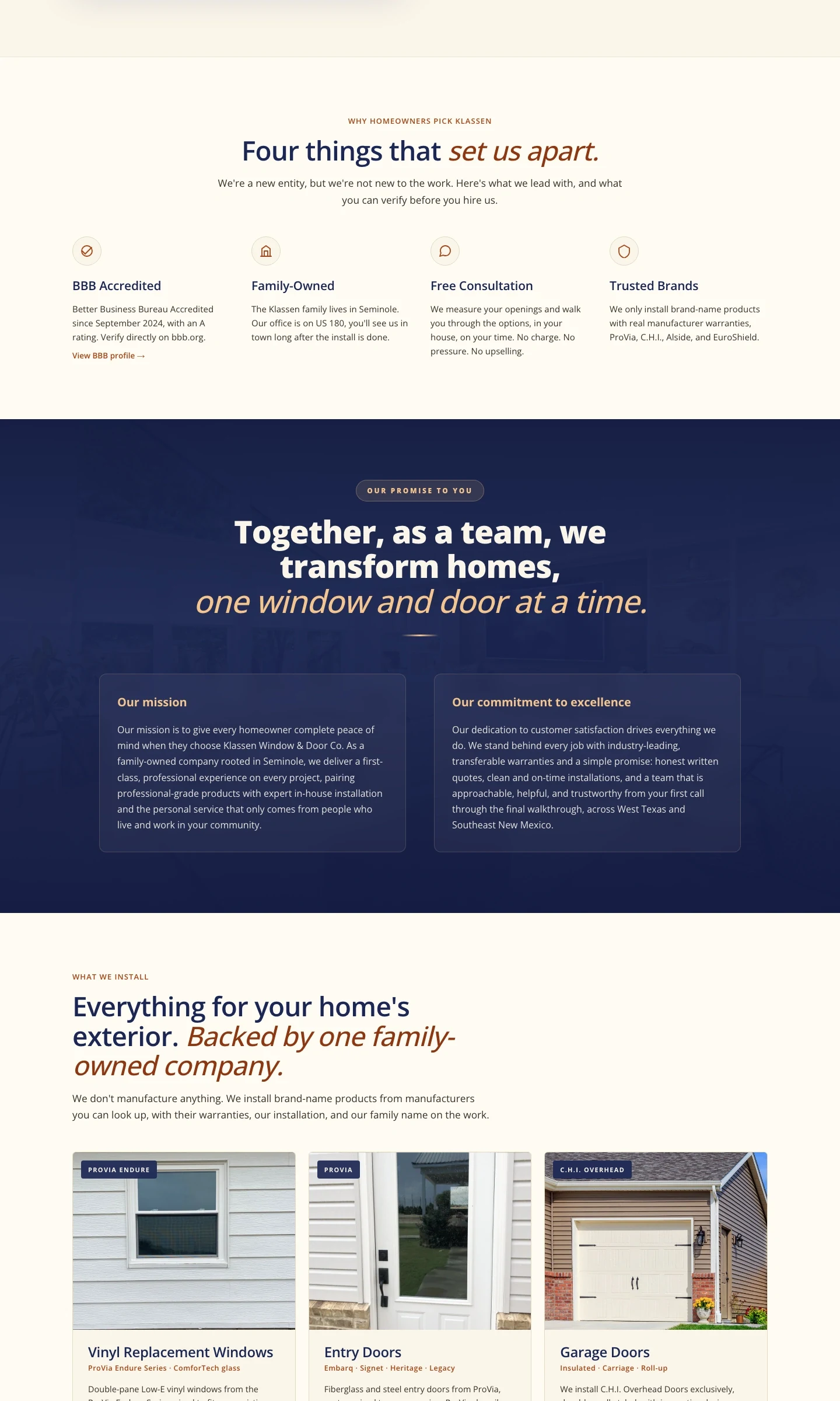
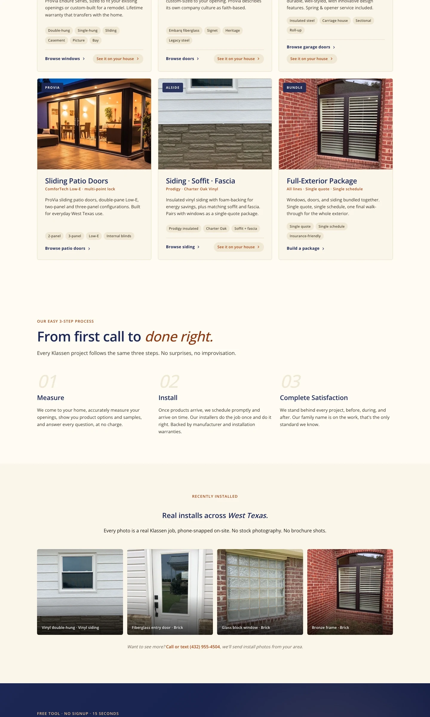
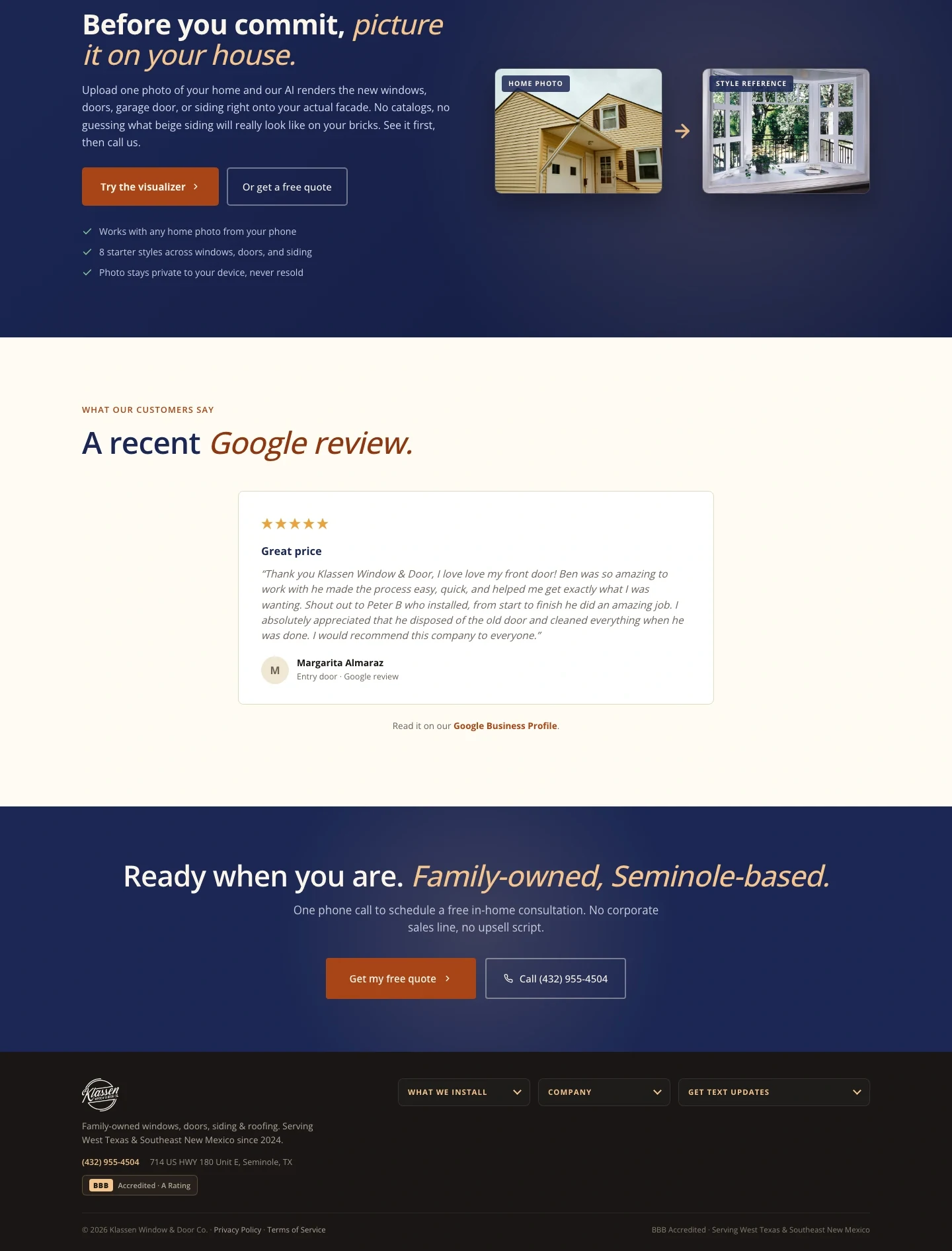
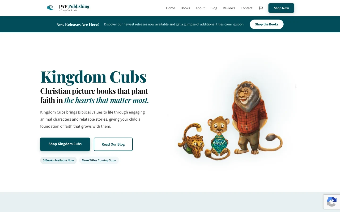
The website uses the same confident type, navy foundation and warm accents. Product imagery, service sections and clear estimate actions extend the visual direction into a longer page.
The brochure gives the brand room to tell a fuller story. The outside brings together a photographic cover, contact details and reasons to choose the company. Inside, services, product imagery and the estimate process unfold across three panels.
We worked with Klassen Window & Door Co.’s existing identity: deep navy, warm cream, bold headings and clear calls to action. That same vocabulary connects the brochure to the website and advertising.
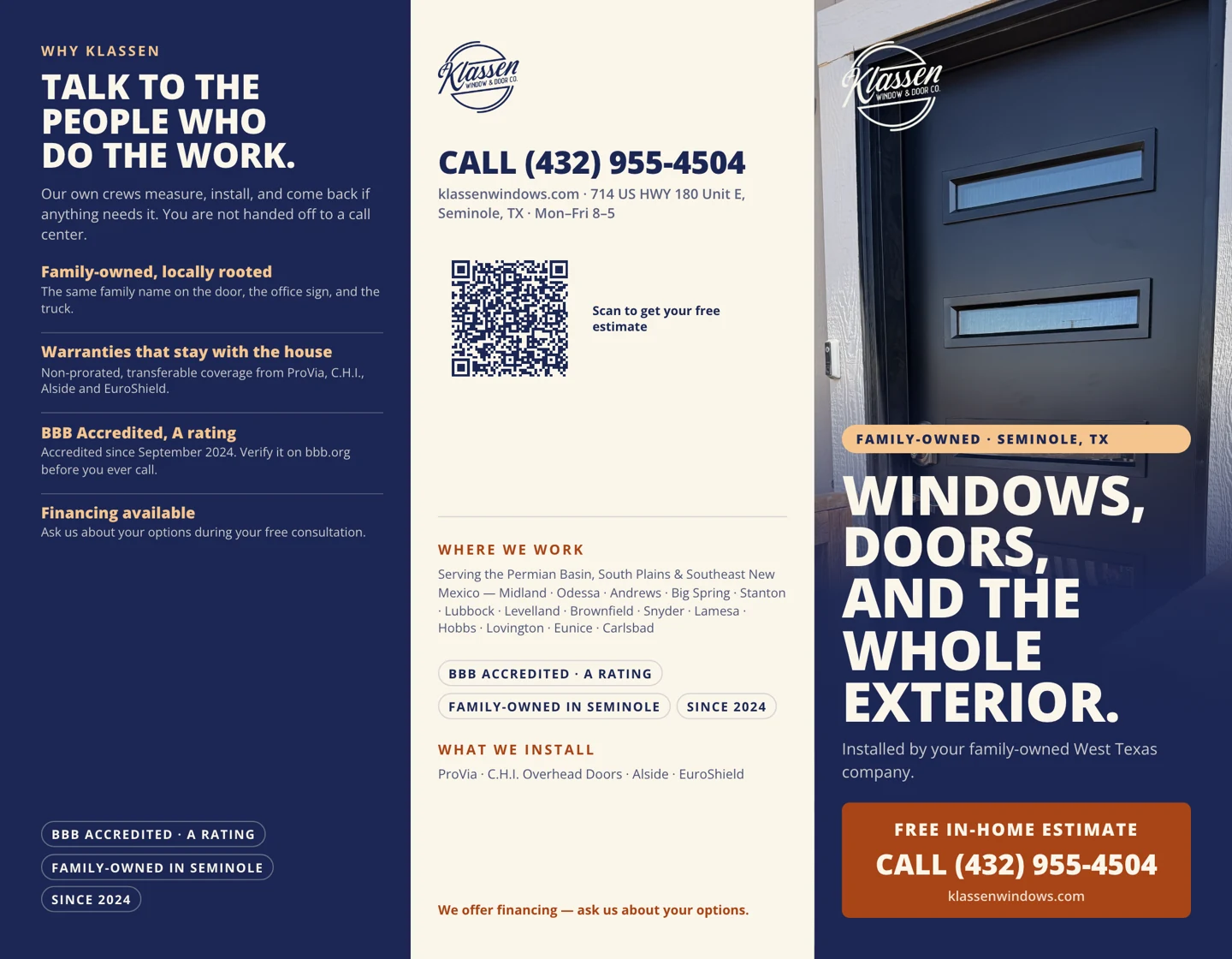
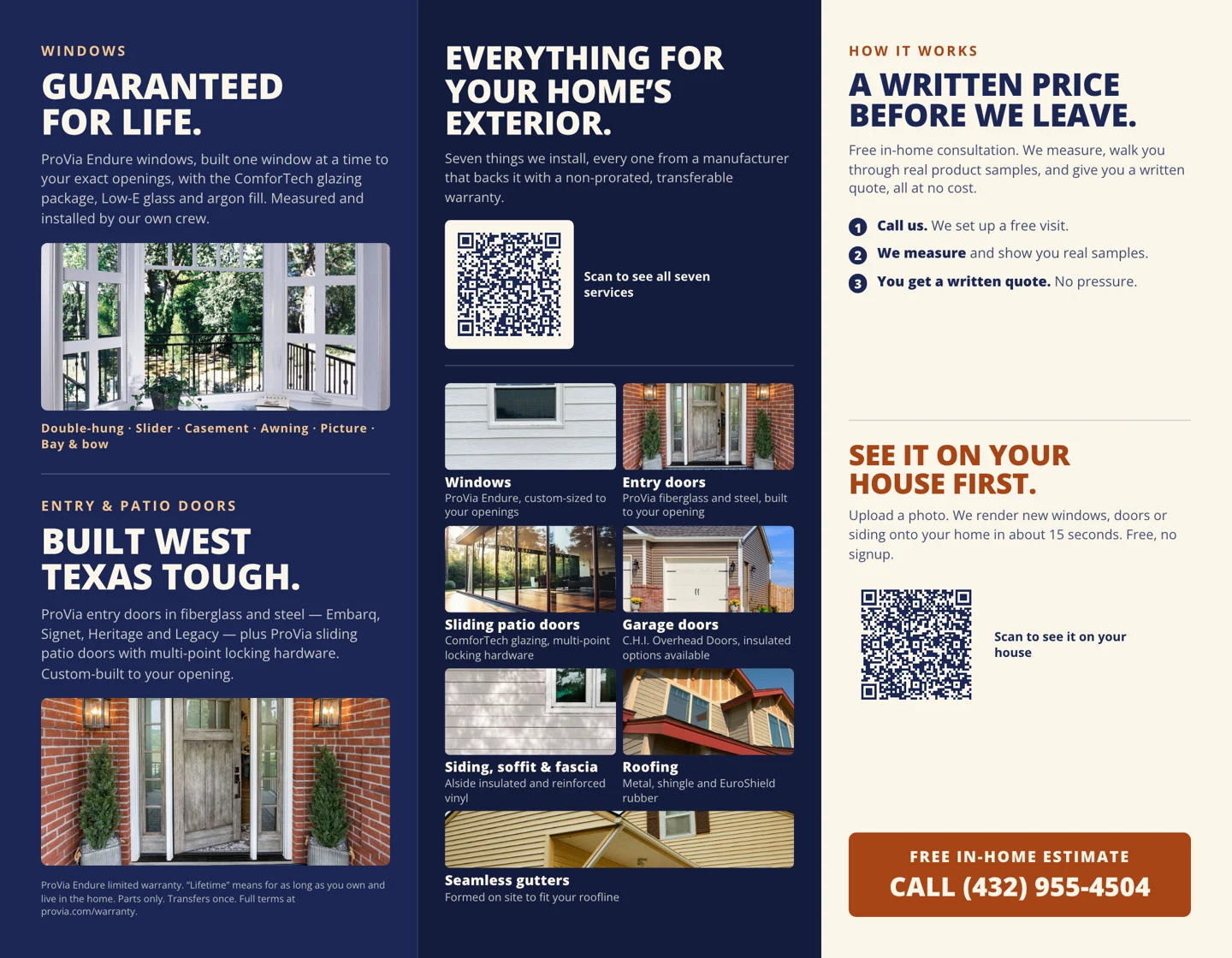
The print work goes beyond placing a design on a page. The brochure was built at an 11 × 8.5-inch trim size with ⅛-inch bleed and ¼-inch safe areas at the edges and folds. Its tuck-in panel is shorter so the layout accounts for the roll fold.
The handout files include PDFs with defined trim and bleed boxes, outlined type and CMYK versions. Text, logos and QR codes were checked against the safe areas; QR destinations were checked from the rendered artwork. These are designs prepared to print specifications, with the printer’s color profile, hard proof and fold check still part of the final production handoff.
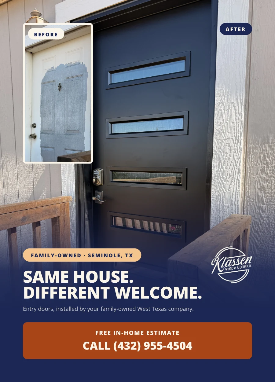
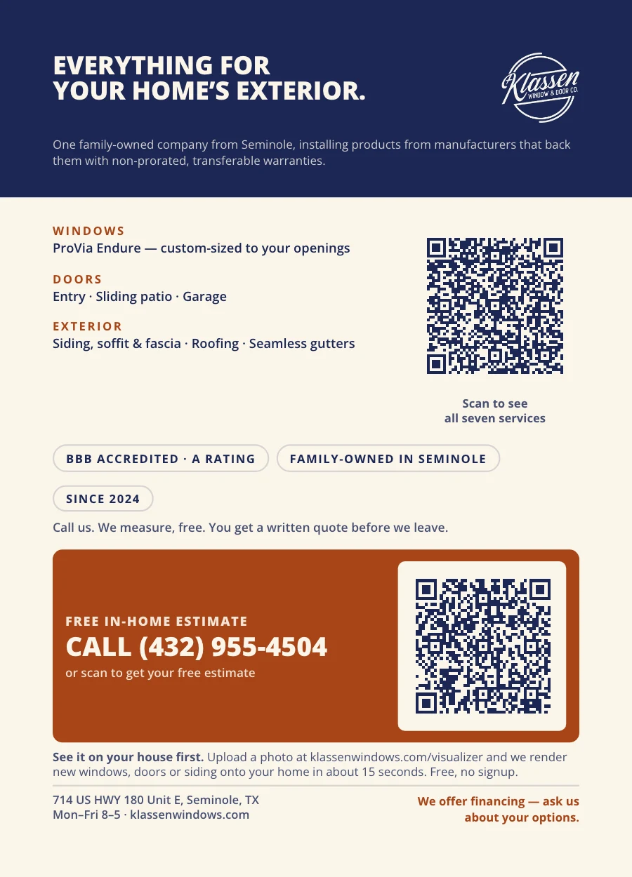
The 4.25 × 6-inch postcard uses a larger photograph and a shorter message on the front, then makes room for the response details on the back. It follows the same navy-and-cream palette and strong headline hierarchy as the brochure.
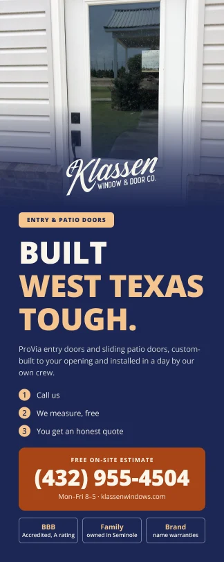
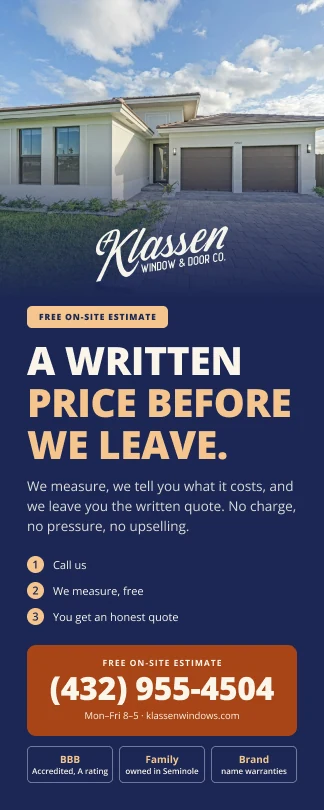
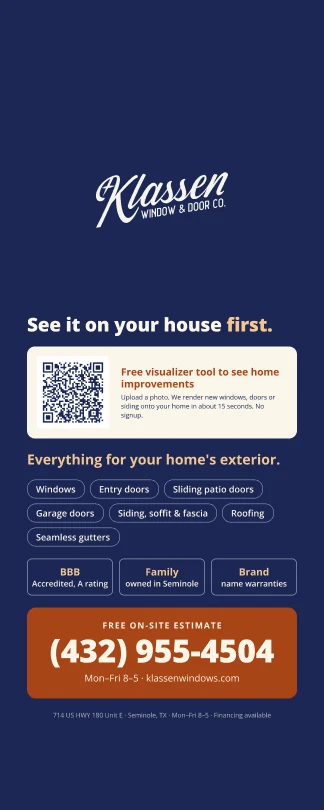
Door hangers carry that identity into a taller, narrower format. The service message gets the front; the shared reverse keeps the contact information and next step consistent across the set.
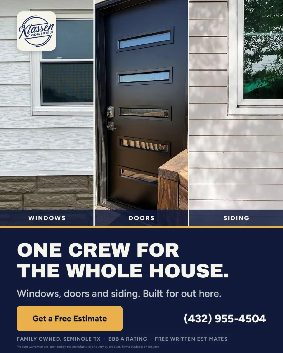
The ad brings the system into a compact format: three product images, one large headline and a clear estimate action. The logo, navy field and warm accent make it feel connected to the website and printed pieces.
Across these formats, the layout changes to suit the job. The visual identity stays recognizable.
This work brings together website design, advertising and physical collateral. A customer can move from an ad to the website, then pick up a brochure or receive a door hanger and encounter a consistent company.
See our ad and social-media design service, or bring your print requirements to a fit call.
Bring your next few requests to a 15-minute fit call. We’ll talk through scope, priorities, and whether one active request at a time fits your team.
Book a fit call See membership details